Behind Our Logo
Share
Q: What's the meaning behind your logo?
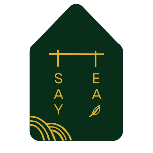
A: We wanted to emphasize that Tsay Tea is not a Taiwanese company, not an American company, but a Taiwanese-American company. One where we rely on Google Translate to mix English with Mandarin Chinese and a sprinkle of Taiwanese Hokkien. This is represented with the English words "tsay tea" written vertically, as with traditional Chinese characters. The connecting "t"s on top is also intentional as it is the root symbol for both Chinese characters 蔡 and 茶, meaning "Tsay" and "tea," respectively.
We love the outline shape that represents a house or teahouse, to symbolize the sense of belonging and that all are welcome here. We also love the full tea leaf to represent the heart of our product, and the lines in the corner are meant to depict the rows and rows of tea plants from which the leaves are harvested.
Finally, the colors dark green & gold embody the colors of the tea plant. It's also a play on my aunt's old tea sign, which still hangs outside her home. Please note I have purposely blurred/removed characters from the sign for privacy :) but you get the idea!


Big thank you to dear Doris Cheng for collaborating with me on the logo!
